Instagram, the photo sharing app, has launched a new logo. Early reactions are dividing fans, but I believe it will become well-loved in the long run, as it uses some clever neuroscience tricks to appeal to our subconscious minds.
Logos, particularly those of mega-popular apps like Instagram, become a familiar part of our lives. Changing them carries the risk of losing all that mental goodwill. Giants of the web don’t have physical presence, like shop fronts; their logos and visual look have to do all the work. They have to appeal to us, be comfortable to look at, and emotionally engage us. To get that level of global appeal, with a design that might have to last years, it’s not enough that a logo just appeals to us consciously—it must also have appeal to our subconscious minds. (highlight to tweet)
For thousands of years, artists, designers, and architects have relied on beliefs about what creates a beautiful design. These beliefs can become hardened over time into rules that may not be as effective as we think. For example, the Golden rectangle—a standard that’s been a favorite of designers since ancient Greece—was tested with a modern audience and found to be less effective than we thought (1).
This is where the new generation of neuroscience research comes in. Neurostrata, the company I work with, has taken a number of lab findings on design from neuroscience, then tested out those ideas in the real world on real designs. We’ve tested everything from package designs for UK supermarket giant Tesco to glossy print ads for magazines. The combination of neuroscience theories and published research with real-world testing on real designs is giving us a better picture of the types of design features that are most universally favored. I call this new approach neuro-design.
The new Instagram logo design is flatter and slightly more abstract than the original design. Some have reacted passionately against it, expressing their disgust on social media. Yet as a researcher who applies neuroscience research to designs, websites, and packaging, I recognize three familiar techniques at work in its design.
1. Visual Saliency
Our world is full of things competing for our attention, yet our eyes can only focus on a relatively small area of our visual field at any time. To deal with this limitation, our brains have evolved a way to prioritize what we should look at. Even before we’ve had the chance to properly decode and recognize a design, its visual features—colors, contrast, brightness, patterns—will have been absorbed quickly and given a priority rating by our brain. Neuroscientists call things with high visual priority “visually salient.” Designs that are visually salient get looked at earlier, more often, and for longer (2).
The new Instagram logo has high visual saliency. It’s likely to get noticed. One of the drivers of visual saliency is high levels of color contrast in an image. The thick, white line of the camera against the rich, colorful background creates high levels of eye-catching visual saliency.
2. Propositional Density
The logo also has another important quality: high propositional density. This is when a design is able to convey a lot of meaning with as little detail as possible. Images with high propositional density are easy on the eye, but intriguing to the mind—or, more specifically, intriguing to our subconscious mind.
The reason why this is a powerful technique comes down to something neuroscientists call “processing fluency.” An image with high levels of processing fluency is easy for us to look at and understand. People prefer images with higher processing fluency, particularly images that are simpler than we expect them to be (3).
The new Instagram design still depicts a camera, but does so in a far simpler way than the old design. It’s unexpectedly simple. This difference in expectation will obviously wear off as the memory of the old design fades and people become accustomed to the new version, but then another psychological effect should kick-in: the mere exposure effect. This effect, well-known to psychologists, means that the more times we are exposed to an image, the more we like it (4).
Of course, while designs that are simple on the surface can be effective, they carry the risk of being boring. Adding in layers of meaning to a design can lessen this risk. This is where propositional density helps.
Designs that evoke lots of meanings with few visual elements are easy on the eye (high processing fluency) yet still interesting to our subconscious mind (avoiding the boredom risk). Good examples of successful logos with high propositional density are the logos for the 2008 Obama presidential campaign and the Apple logo.
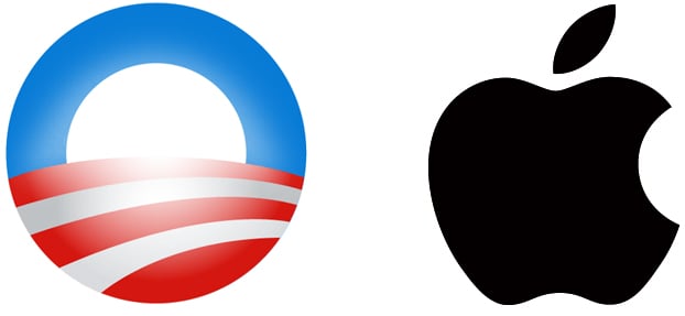
Both are visually simple yet loaded with potential meanings. The apple has connotations of knowledge and learning, of something natural and healthy, and good for children. The Obama logo reminds us of the American flag, has a sunrise (which itself evokes hope and fresh beginnings), the red stripes look like a plowed field, and the logo’s shape evokes the “O” in Obama’s name. The number of meanings a logo evokes will depend on the individual viewer, so logos that evoke as many universal meanings as possible are best.
The new Instagram logo depicts a camera, but in the most minimal way, with just a square, a circle, and a dot. However, true to the first logo, it’s not a contemporary camera—it’s an old, 1970s or 80s, Polaroid-type camera, carrying connotations of nostalgia, childhood, family photos, and so on. It’s overlaid on a color-array background. The warm colors (notice that they haven’t used any cold colors) convey energy and excitement. They also look like a sunset, a time that filmmakers call the magic hour, when some of the best photography can be done. The sunset also carries connotations of the evening, nights out, fun, etc. Of course, most of these associations will be triggered subconsciously, as most people won’t stop to think too hard about the design consciously.
3. The Power of Curves
Lastly, the logo is curvy. Research shows that, with some exceptions, people generally prefer curvaceous designs over ones that are more angular (5). Curves can make a design feel approachable, friendly, and even cute. Our brains have evolved to rapidly detect pointy or sharp things around us so that we can avoid hurting ourselves on them. While we rationally know that a design can’t hurt us, this subconscious scanning for angular corners goes on without us really being aware of it.
With more and more companies adopting neuro-design research, I wouldn’t be surprised if Instagram’s new logo is the product of this type of testing and development. I believe this neuroscience-inspired approach will continue to grow into a rich field of insights for design. Just as tech tools like Photoshop extend the artistic skills of designers, neuro-design will help augment designers’ intuition about what makes a design attractive and effective.
References
(1) McManus, I.C., Cook, R. and Hunt, A., 2010. Beyond the golden section and normative aesthetics: why do individuals differ so much in their aesthetic preferences for rectangles?. Psychology of Aesthetics, Creativity, and the Arts, 4(2), p.113.
(2) Mormann, Milica Milosavljevic and Towal, R. Blythe and Koch, Christof, Visual Importance of Marketing Stimuli: Insights from Visual and Computational Neuroscience (December 29, 2015). Available at SSRN: http://ssrn.com/abstract=2709187 or http://dx.doi.org/10.2139/ssrn.2709187
(3) Graf, L.K. and Landwehr, J.R., 2015. A Dual-Process Perspective on Fluency-Based Aesthetics The Pleasure-Interest Model of Aesthetic Liking.Personality and Social Psychology Review, 19(4), pp.395-410.
(4) Bornstein, R.F., 1989. Exposure and affect: Overview and meta-analysis of research, 1968–1987. Psychological bulletin, 106(2), p.265.
(5) Bar, M. and Neta, M., 2006. Humans prefer curved visual objects. Psychological science, 17(8), pp.645-648.
Get more content like this, plus the very BEST marketing education, totally free. Get our Definitive email newsletter.
Source: Convince and Convert